14 Vintage Restaurant Logos That Deserve A Comeback
We may receive a commission on purchases made from links.
While a restaurant's food and drink are the foundation of its success, its branding is just as critical. At the heart of that brand is the logo — a customer's first introduction to the identity, and a familiar sign of welcome for those returning. Restaurant logos are so ingrained in culture that they extend far beyond signage and packaging, showing up on merchandise, sports sponsorships, and even in films and television. But nothing lasts forever.
To stay relevant, chains often refresh or reinvent their logos. Sometimes this works, but often it feels unnecessary, or a violation of something sacred, even alienating loyal customers. Recent history shows the risk — in 2025, Cracker Barrel unveiled a remodeled look to its stores and a pared-down logo, stripping away its classic imagery and losing something in the process. The backlash was immediate and fierce, forcing the company to reverse course.
Most redesigns arrive with less fanfare, but many still leave fans wondering why. With that in mind, let's revisit some vintage restaurant logos that captured attention, built loyalty, and deserve a comeback.
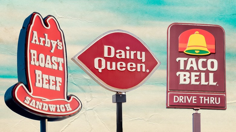
1. Arby's
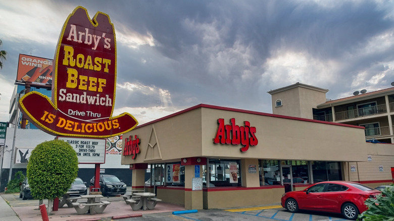
When brothers Forrest and Leroy Raffel opened the first Arby's in 1964, the roast beef chain turned to Ira Thomas and Associates to help stand out from burger joints. Inspiration for a logo came when the ad execs wanted to get home in time to see the hit western show Bonanza, whose main character, Hoss, sported a big 10-gallon hat. Arby's logo proudly spelled out its main product, displaying "Arby's Roast Beef Sandwich is Delicious" on the hat. The larger-than-life hat appeared in ads, lighting up the sky in 40-foot-high road neon signs. Sadly, not many of those signs remain on roadways today.
In 1975, Arby's simplified its logo to pretty much what it looks like today — the outline of a slightly more subdued hat, with just the chain's name sitting above the brim. While Arby's is certainly more than roast beef these days, a tall hat reminding customers of how it got this far would still go a long way today. If only Arby's had employed Pharrell Williams to help push the idea, as he once wore a hat everyone mistook for the logo, which the chain ended up winning in a charity auction.
2. Chili's
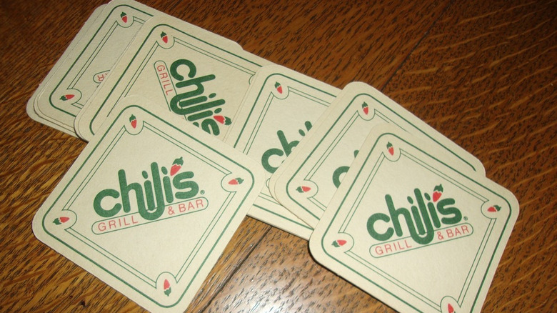
Founder Larry Lavine originally wanted a chili pot as part of the logo for his new restaurant Chili's, which opened its doors in 1975. Designer Grant Saint-Claire thought it would look like a spittoon, so he opted for a chili pepper. While Saint-Claire's logo featured a curvy "h" connected to the first "i," the next iteration of the logo was truly its best — the "h" connected with the "l," letting the first "i" sort of float above a comfy-looking hammock.
At this point in human history, most people can look at a red chili pepper and identify what it is. It's such a common sight that it even has its own emoji, and Chili's logo has always featured a drawing of a red chili, famously utilized as a possessive apostrophe. In 2011, the brand decided to shake things up with new advertising, a new look for the restaurants and menu, and even a refresh of the logo, which jettisoned the company's name entirely. All that remains to represent the brand and its vibe is that familiar chili. The older logo, with the curvy link between the "h" and the "l," emits a feeling of comfort, and there's no reason for it not to be doing a similar job in this day and age.
3. Church's Chicken
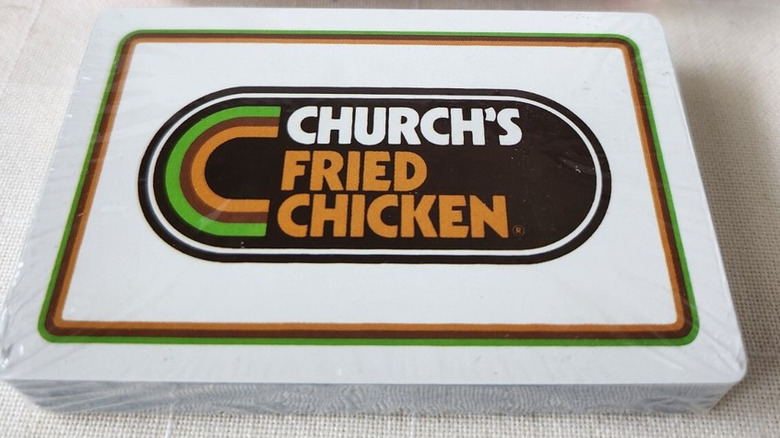
George W. Church started deep frying chicken in 1952 at Church's Fried Chicken To Go, across the street from the Alamo, no less. With a rise in popularity, by the end of the decade, Church's Fried Chicken had franchised to over 100 locations spread out across seven states. During this time, a cursive "Church's" was the focal point of the company's logo.
By 1977, Church's took its logo in a new direction, leaving behind its cursive nature. The new one displayed its name in a clean, sans-serif font, with a green and golden rainbow, magnet-like C as the focal point, all contained in a racetrack oval. This mighty logo lasted over a decade, but by the end of 1988, the chain slimmed down locations, and its name too. It dropped "fried" from its signs, and with it came a new logo that lacked the previous one's luster. The logo has changed four times since, with no subsequent version ever able to capture that late '70s magic.
4. Dairy Queen
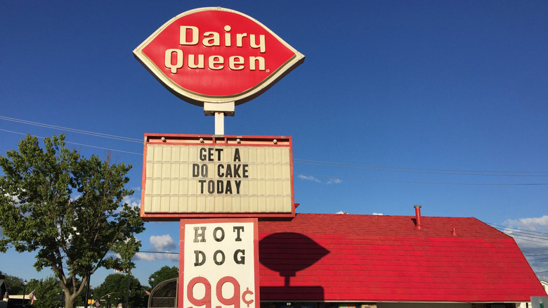
Joliet, Illinois, was home to the very first Dairy Queen, which started serving its own brand of ice cream by Sherb Noble in 1940. The original logo was a pretty straightforward display of the name, and many locations incorporated an ice cream cone on the signs. In 1958, in an effort to further unify the look of all locations, as well as grab the public's attention, the chain turned to the firm Lippincott & Margulis to update its corporate colors and logo. A year later, a red ellipse encompassing Dairy Queen's name in white started to appear in ads and at locations, before being officially unveiled in 1961.
With its soft shape, this distinctive logo could have been interpreted as a leaf or perhaps an open eye. The logo was gorgeously accented with wordless red and blue ellipses on ice cream cups and packaging. Meanwhile, locations that also sold savory food had signs with the word "Brazier" displayed in a bright yellow ellipse. Texas has a ton of Dairy Queen locations, and in a clever billboard campaign in the late '90s, the logo was described as a "Texas stop sign."
This iconic shape has stood the test of time, even after the company shortened the name in the logo to DQ and italicized the lettering for the 21st century. After acquiring Orange Julius, the logo got an orange-like eyebrow and a blue curve below it by 2003. That logo went company-wide four years later, but with this busier look, it isn't exactly the stop sign it once was.
5. Del Taco
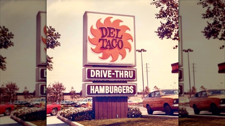
Del Taco's history runs through sunny California, with Ed Hackbarth opening a location in Yermo in 1961, and partnering with David Jameson to turn it into a franchise three years later. The symbol of the chain reflected its environment — a sun with buzzsaw blade-like rays that looked to be in constant motion. The original version of this sharp sun had a brown fill, before it moved to a more lovely shade of orange in the groovy '70s.
The good times weren't meant to last, as the sun and company name separated, and were instead surrounded by a cool blue color. After it reacquired its name and trademark, Del Taco sought to refresh the entire franchise in 1992 in a push to take on Taco Bell. Part of the move included going in a new direction with a logo to match, where the angled name, now in red, sat below an outline of a green mountain, which had a more cartoony sun rising behind it. While it was nice to see the buzzsaw sun return to the logo in 2011, it no longer shines as brightly as it once did in its heyday, when there was no terrain to eclipse its full splendor.
6. Hardee's
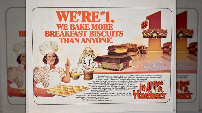
Wilber Hardee's first namesake restaurant in Greenville, North Carolina, opened in 1960, displaying a sign with an "H" to lure in drivers. The "H" was stretched in four directions, almost resembling an "X," and hit the spot with its simple design, as Hardee's became a franchise. By 1968, orange was added as the key color to tie it all together.
Hardee's employed the services of the firm Lippincott & Margulis to rebrand itself, resulting in a new logo in 1975. This one was presented in a fun font that looked like it was being squeezed and jumping out for joy at the same time.
In 1997, Carl's Jr.'s parent company CKE Restaurants Inc. acquired Hardee's, and subsequently initiated a union between the two burger chains. That eventually spelled doom for the magical logo, as Hardee's adopted Carl Jr.'s logo look, including its shooting Happy Star mascot. Although the brands officially split in 2018, Hardee's continued forward with this borrowed logo.
7. IHOP
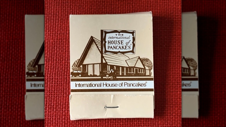
Pancakes have long brought smiles to eaters' mouths, and IHOP lets customers know it hopes to do the same with a logo that sports a happy grin. Designed by Studio Tilt in 2015, this IHOP logo has a semi-circle line sitting below the "O" and the "P," forming a mini-face that's not all that dissimilar from Colgate or Amazon logos, and downright clownish. The logo is certainly an improvement over its previous version, which featured the word "restaurant" in a frown shape, but neither can top the classic one that started it all.
The International House of Pancakes opened in 1958, and the chain's old school logo featured an ornate orange frame, containing the restaurant's wordy name displayed within. This sign showed there was something a bit worldly, even fancy, yet still homey residing within. It didn't take long for the restaurant to be affectionately known by its catchier "IHOP" nickname, and by 1971, an IHOP logo started making the rounds. While it was quicker and easier to identify and read, the charm and elegance were lost when it was reduced to just four letters.
8. Jack In The Box
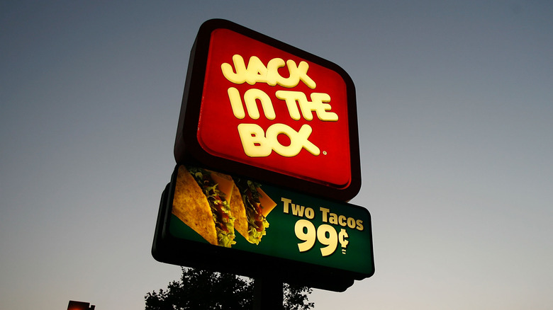
The fun jack-in-the-box toy has been delighting users since the 16th century, but the name took on new meaning when it was co-opted by Robert O. Peterson for his burger joint, which opened in 1951 in San Diego, California. The restaurant's logo featured the face of a deranged-looking clown for quite a while, but the chain never seemed to settle on an image to sell to the public. In 1985, it even made the bold move to rename and rebrand the chain as Monterey Jack's in an effort to appear more upscale. Spoiler alert — it didn't work.
Jack In The Box's logo was at its best when the clown and name lived in the box, not when they were jumping out of it. There was a great period from the late '70s up until the first decade of the 21st century that included several good looks. There was one with a silhouette of the clown juggling three balls below it. The one that followed used the same imagery but smaller, and was joined by a clean and bubbly font spelling out the name. The last logo in that solid line showed no clown at all, but kept the same appealing font, displaying the box on a slight tilt. Any of those would be preferred over the logo we've been stuck with since 2009, which has the name "Jack" in a blasé cursive font, alone in the box.
9. KFC
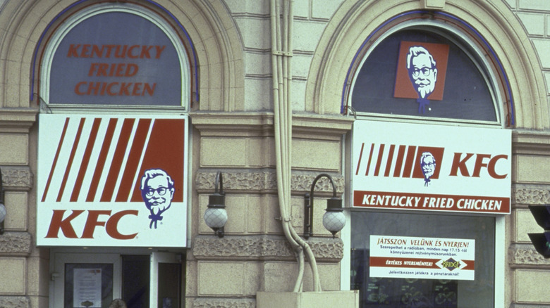
There would be no Kentucky Fried Chicken without Colonel Harland Sanders, who has always been the face of the franchise (literally). A drawing of his face has adorned franchised locations since the 1950s, and even though the good Colonel passed away in 1980, he remains a large part of the brand's iconography.
The logo has continued to honor the man, the myth, the legend, with his fluffy hair, dark glasses, smirking grin, slick Van Dyke beard, and signature western ribbon bow tie. The original logo from 1956 was a bit too cartoonish looking, and the current one makes him out to be a goofy old man, a little past his prime. The perfect Colonel logo started appearing by the end of the 1970s, a rendering with full black-rimmed glasses, contoured hair that better reflected his actual locks, and a slightly opened mouth, as if he's about to say something witty. This golden era logo hung around for two decades before sadly being retired.
10. McDonald's
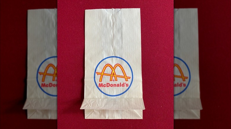
There's no denying the awesomeness and power of McDonald's logo. Just say the phrase "Golden Arches" and you can picture that neon yellow sign, sometimes against a red backdrop, and other times not, calling your name in your neighborhood, at an exit off a highway, or as a welcome sign in a land far away from your own.
When Ray Kroc bought the McDonald's brothers out of the business in 1961, he ditched their old winking Speedee logo and went with a sleeker, modern one, helping push the franchise in a new direction. He turned to employee Jim Schindler to design the new logo, a three-dimensional design that paid homage to the two arches that prominently bookended the McDonald's hamburger stands at the time. The arches slightly overlapped to form an "M," which was then intersected by a line pointing up to resemble the structure's roof.
As the chain moved away from that store design, the logo was simplified in 1968, dropping the intersecting line, as well as spacing out the arches as it is today. Many of us wish McDonald's would revert its buildings to those retro stores of the '50s and '60s, and in turn, rewind the clock on the McLogo as well.
11. Sbarro
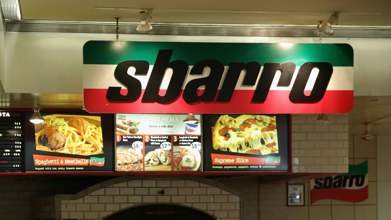
Hard to believe it now, but the Sbarro pizza chain sprang from humble beginnings as a mom-and-pop salumeria in Bensonhurst, Brooklyn. Carmela and Gennaro Sbarro, along with their three sons, immigrated from Naples, Italy, in 1956, and set up shop making fresh mozzarella, lasagna, salads, and eventually pizza. Demand for the latter expanded Sbarro's good name to more locations, with its first mall-based one opening in Brooklyn's Kings Plaza Shopping Center in 1970. It quickly became a global mall food court staple, and the spot where many people had their first New York slice.
While it's not exactly clear when the chain started using it, its best-branded logo displayed the family name on the white middle stripe of the Italian flag. It was such a solid logo that it appeared on the side of cups and even paper hats that employees would wear. The Sbarros left the family business in 2007, and the logo changed seven years later, losing a bit of its soul, as the Italian flag was folded away and replaced by the outline of pizza slice.
12. Taco Bell
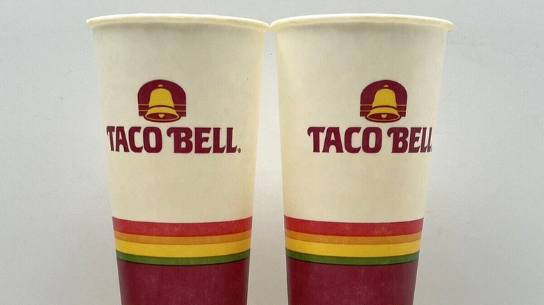
Without Glen Bell, there would be no Taco Bell. He opened the very first restaurant back in 1962 in Downey, California, and ever since, the graphical use of a bell has been incorporated as a part of the branding. Today's version of the Taco Bell logo is a variation of the one introduced back in 1992 — a tilted bell with a splash of purple.
Besides the artist Prince, the Minnesota Vikings, and Grimace, perhaps no one has sported purple as well as Taco Bell has. At this point, it would be hard for the chain to distance itself from the color, but Taco Bell has often tapped into its past for present inspiration, including its throwback Decades Menu. There are two logos in its past that would still work well today, both purple-free.
The original one spells out the name, with each letter in its own colorful box, spilling into the following letter. Another worthy option is the one that was initially used in 1984, when the company embarked on a path to Americanize itself to compete with titans like McDonald's. Out with the drab hues, and in with a sunny rainbow of colors, where a yellow bell with a green interior shadow was surrounded by a red background with two yellow stripes.
13. Wendy's
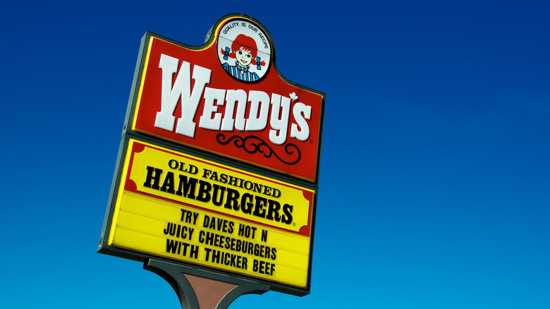
Wendy's has long been a burger chain steeped in a sense of nostalgia. Dave Thomas opened the very first location back in 1969 in Columbus, Ohio, with "old fashioned hamburgers" as its motto from the start. At the center of the company's logo was Thomas' daughter, Melinda Lou (her nickname was Wendy), the freckled, redheaded girl in pigtails who inspired it all. While this lovingly childish logo changed slightly over the next four decades, including the incorporation of a stark splash of yellow as a background, it constantly remained as a sign of comfort.
In 2012, Wendy and her logo got a makeover, as the famous image of Thomas' daughter was tweaked, with the pigtails pointed lower, and Wendy's face made to appear a little more grown-up. No longer priding itself only on hamburgers, the chain began to sell a lot of chicken and salads, and "old-fashioned" was no longer in fashion. That motto was entirely removed from the equation in this redesign. Also, the serif font was replaced by a new curvy one that embarrassingly borders on Comic Sans territory. Then chief marketing officer at Wendy's Restaurant Group, Craig S. Bahner, told Nation's Restaurant News that it was "a signal of the brand transition we have underway." That's nice and all, but we're not sure our beloved Wendy is like Millie and requires being this thoroughly modern.
14. White Castle
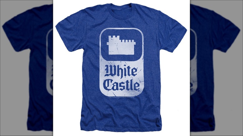
The very first White Castle started slinging square hamburgers in 1921, and when business warranted expansion, it became one of the very first fast food chains in the nation. While the food was certainly a draw, the buildings the chain was housed in were equally appealing — small ivory white kingdoms, complete with turreted towers, and an old English-style font sporting the name.
For the longest time, the logo was simply the name, but as new locations started to look less like actual castles, White Castle kept that image alive in its logo. The best version remains the one that existed by 1983, where a rounded rectangle played host to a silhouette of a white castle, with the familiar and famous scripted name below. By 1997, the shape of a castle became the focus of the logo, and while it was an inspired choice, it eventually led to its current one, adapted in 2003, which looks more jester-like than of a royal nature.