

1948 Vs 2026: McDonald's Logo Was Completely Different Originally
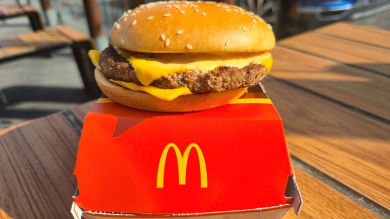
A pair of connected golden arches forming the letter "M" is one of the most recognizable symbols in the world, as immediately identifiable as most religious iconography. It's printed on storefronts, bags, and billboards all across the world, instantly communicating not only the presence of McDonald's but, more broadly, American hegemony across the globe. Imagining a world without the Golden Arches is like imagining a world without McDonald's — which is to say, almost impossible. And yet, once upon a time, McDonald's was a fledgling burger stand, and its logo was pretty much unrecognizable.
There were no golden arches to be found in 1948, when brothers Maurice and Richard McDonald opened their first hamburger stand in San Bernardino, California. There was just a sign advertising $0.15 hamburgers, accompanied by the mascot Speedee, a curious moon-faced fellow in a chef's hat. (Not moon-faced in the sense of Mac Tonight, of course, who can be found at the world's largest McDonald's in Florida — just in the sense of having a round, pale head.) It certainly worked well enough at first, but soon enough, the McDonald brothers wanted to move into a new building, with an entirely new, eye-catching design to attract motorists. That was where an architect named Stanley Clark Meston came in.
After the first logo, McDonald's got the arches fairly quickly
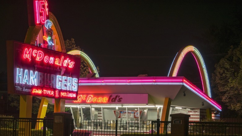
The Golden Arches — or at least, the concept of golden arches, even if they weren't attached to each other — came from Richard McDonald. He liked the idea of an arch as a memorable symbol for a restaurant, and sketched it out for Stanley Clark Meston, who made it even better. The result was two arches, one on either side of the new building, plus one at the front holding up the previously existing sign, Speedee included. In 1953, the new design went up. A year later, milkshake machine vendor Ray Kroc visited McDonald's for the first time in 1954, and eventually became McDonald's franchise manager in 1955.
Seven years later, in 1961, Kroc had wrested control of the restaurant from the McDonald brothers (through some corporate chicanery dramatized in the Michael Keaton-starring film "The Founder"), and he was all set to give the restaurant a new logo. And say, do you know what it looks like when you're driving past a McDonald's and you see those separated golden arches? It kind of looks like the letter M! McDonald's head of construction and engineering, Jim Schindler, whipped up a new logo, becoming the first to incorporate the M-shaped golden arches. However, Schindler's creation had a diagonal line running through the arches, and it wasn't ditched until the late '60s, more closely resembling the current logo that continues to adorn every new-and-improved burger and best-selling carton of fries the chain sells.