Why Every Can Of Campbell's Soup Is Printed With A Medal
Most of us have heard the saying, "If it's not broke, don't fix it." The concept is big in marketing and branding, and there have been plenty of examples of what happens when companies don't follow this advice, like Cracker Barrel's heated logo change controversy. For the most part, Campbell's Soup has left its condensed soup cans the same since 1900, when it added a medallion to the center of its labels. Although Campbell's Soup has had its share of controversies, the classic logo hasn't been one of them. Generations of soup eaters have visually recognized the same branding for over 100 years. While we have all seen the medal, how many of us have actually really looked at it and wondered why it was there? I, for one, had not until this writing.
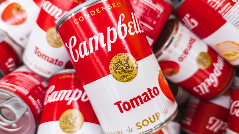
The printed medal didn't appear on labels until 1900. This was the same year that Campbell's won a bronze medal for product excellence at the Paris Exposition. The company added the medal in commemoration of the event and never took it away. The biggest change to the soup label happened in 2021, but the alterations were subtle. While the main colors remained red and white, some of the wording was moved or shrunk, and the tomato soup can included a picture of a tomato. But the medal remained, even looking a little sharper. And perhaps one of the biggest boosts Campbell's ever got was when artist Andy Warhol introduced his pop art series of Campbell's soup cans, giving the public a closer look at the medal detail, although he sometimes left it as a blank circle. Still, fans knew what it represented.
A deeper look at the Campbell's soup can medal
Beefsteak Tomato became the first Campbell's Soup flavor in 1895, and the company debuted its condensed cans of soup in 1897. The medal on cans of Campbell's condensed soups was inspired by the bronze medal given to the company three years later, which itself was designed by J.C. Chaplain (a renowned medal engraver) and fashioned by the Paris Mint. The artwork features a winged figure carrying a victor, who is holding a torch and wearing a crown of leaves. The words "Paris International Exposition" emblazon the outer edge of the circle, and the year "1900" is written on a scroll at the bottom of the art. The exposition events buildings are shown in the background.
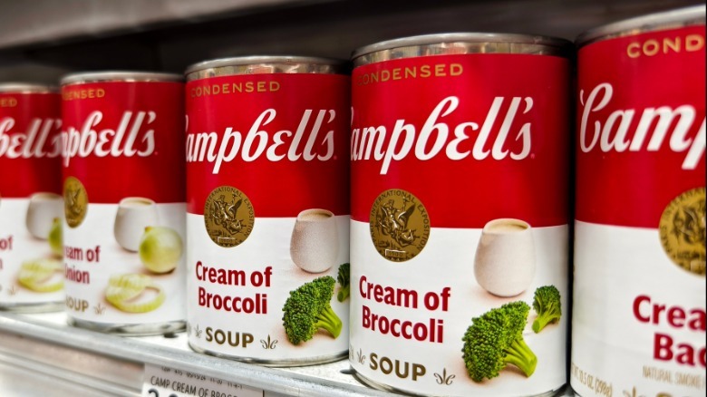
While the medallion has been a fixture on condensed soup cans since the turn of the 20th century, there have been occasions when it was altered slightly. On one modern tomato soup label that featured a bowl of soup on the bottom of the can, the medallion was noticeably smaller. And in 2012, Campbell's released a variety of multicolored labels that celebrated the 50th anniversary of Andy Warhol's iconic Campbell's soup series. In these, the famous medals were depicted in yellow, orange, and pink colors, paying homage to Warhol's signature bright color style. While the company received a bronze medal for innovation in Paris, it certainly deserves a gold one for lasting brand power and consistency.