The Sneaky Reason Restaurant Walls Are Painted Certain Colors
Restaurant owners aren't solely focused on creating an outstanding menu that will draw a crowd. Sure, that's the main priority, but there are plenty of sneaky little details inside the establishment designed to help bring in the dough. From dim lighting in a restaurant to the plateware it serves your food on, every aspect of the building is intended to boost profits. The restaurant's wall color is also a specific hue for a reason. Most owners aren't just slapping any paint they can find on the interior before it has its soft opening. If they know what they are doing, they are using psychology to their advantage and utilizing colors that will maximize revenue.
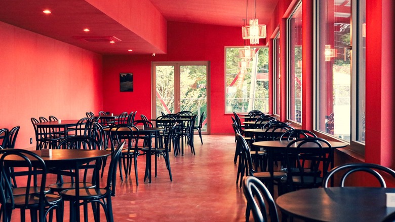
Various pigments can elicit subconscious thoughts from diners. For example, if the restaurant's wall color is red, it is presumably trying to encourage you to order more food, as that particular hue can make people hungrier than when they first arrived. Similarly, if you see walls sporting orange, the establishment might be serving food deemed less than nutritious in some circles, and they are trying to make you feel happy about splurging on a treat, like ice cream. And it's not just red or orange, or even one color in particular, that restaurants choose to exploit as a means of getting you to open up your wallet. Different color schemes have contrasting effects on customers, and restaurant owners tailor their establishments to certain shades for a reason.
A restaurant's color scheme is there for a reason
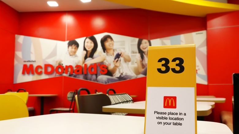
Red may make folks hungrier, but warm color schemes in general not only increase a person's appetite, they invoke a sense of excitement. When a restaurant's wall colors are red and yellow (looking at you, McDonald's), the reason is that it is trying to boost the dollar amount on each customer's check. Yet, after a while, those pigments become a bit much for our brains. We tend to leave faster than we otherwise might, which is perfect for the Golden Arches because faster customer turnover means more revenue.
On the other hand, lighter tones such as white and beige can convey a sense of relaxation and make the place appear roomy, which allows people to feel at home in that environment. This is ideal for fine dining establishments like Michelin-starred restaurants that don't necessarily need you to be hungrier to spend more money because the menu is often already filled with high-priced cuisine. Institutions of that caliber want customers to be comfortable and content, making them feel good about splurging on something expensive when they place their order.
Vegetarian and vegan restaurant wall colors commonly feature earthy tones, and you can probably guess why. Those shades remind people of nature, which perfectly encapsulates the core healthy and organic concept behind those types of establishments. Whether it's the dark hues creating a sense of intimacy or the pastel tones giving you calm vibes at your local bakery, a restaurant's wall color is rarely a coincidence, but rather, a sly way of benefiting its bottom line.