TIL Why Most Fast Food Logos Are Red
It's something I hadn't even really thought about until this Business Insider video pointed it out: The vast majority of fast-food logos are red-based. The educational (yet under-four-minute) video also outlines that there are reasons for that that go back thousands of years.
Red is among the most primal of colors, one of the first shades there was an actual word for after "black" and "white" in the B.C. era (The word "blue" didn't show up until 200 A.D.) So it appeals to our primal instincts, and also inspires feelings of anxiety (hence its use in the stop sign) and hunger—perfect for fast-food companies wanting to make those who see their logos as hungry as soon as possible.
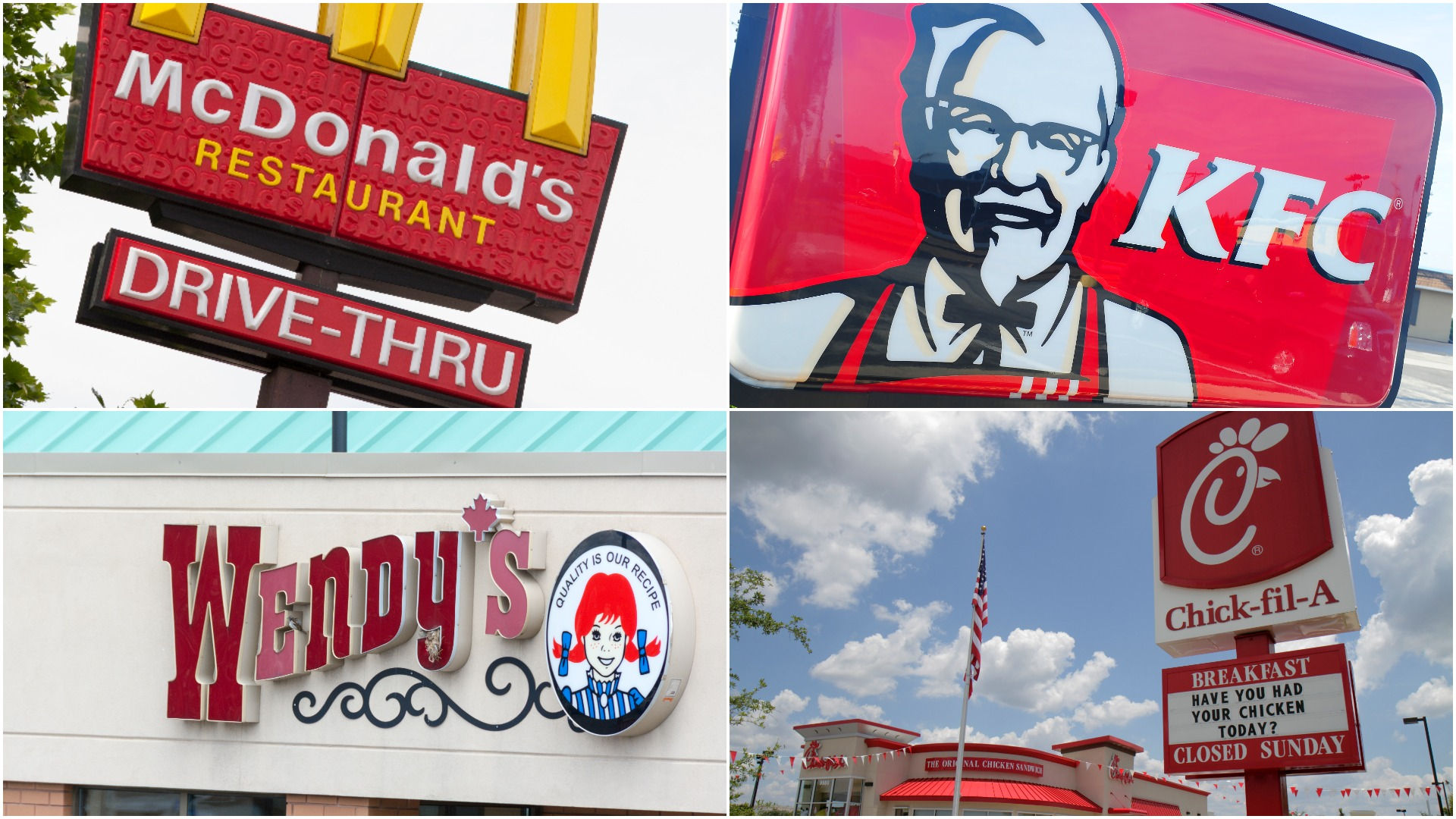
As "red" is also associated with blood, the shade also appeals to the more carnivorous among us (there's a reason why more "natural"-based options, like Whole Foods, have a green logo). This makes it popular among meaty brands like McDonald's, Chick-Fil-A, Wendy's, Arby's, In'N'Out Burger, and Jack In The Box. It's also one of the rare colors popular in several national cultures, from China to India to the U.S.
Business Insider concludes: "So that red logo isn't just a welcoming sign, it's a sly seduction for your brain." It seems pretty obvious once it's all laid out. But it's also a reminder to take a second look at the secret meanings behind the signs and logos you encounter every day.