Popeyes Debuts A Chic New Aesthetic To Pair With Its Sandwiches
Now that Popeyes has entered the annals of history as one of the greatest fast food success stories of all time, it's removing its proverbial glasses and ponytail and getting a celebrity makeover. The beloved fried chicken sandwiches will stay the same, but the environs in which patrons can order and eat them (once dining room restrictions are lifted) are getting a refresh.
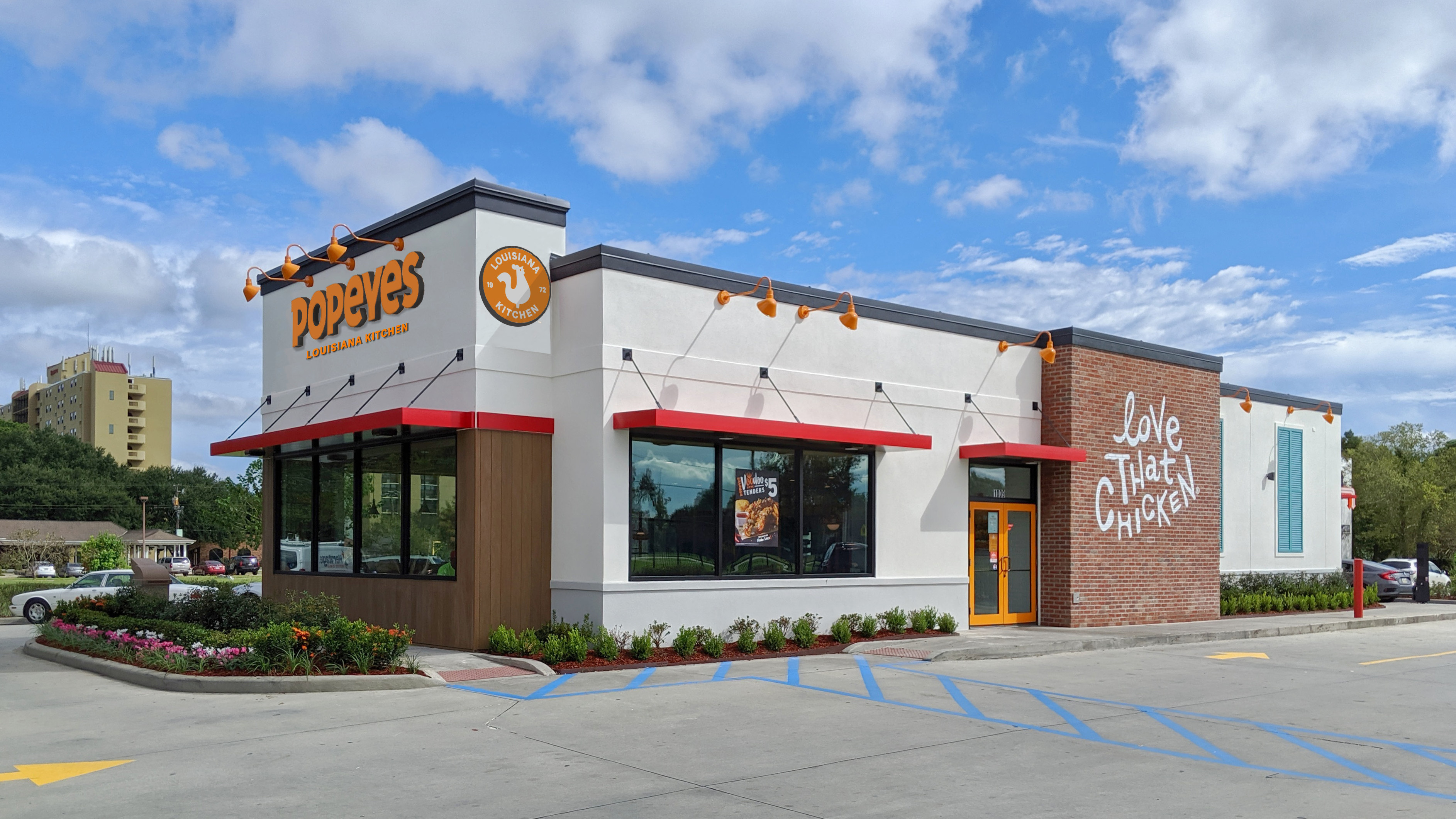
According to a press release, the new restaurant building is being piloted in Marrero, Louisiana, and the details of its design suggest that fast food architecture is far more carefully considered than I as a customer ever thought about: "The powder coated metals in the furniture and counter design are inspired by the iconic Saint Charles Market Car, utilitarian spaces and handcrafted details nod to the creative culture of the Bywater in New Orleans, and the personality and artwork celebrate the creole heritage that's been passed down over generations." Customers in other states can expect an eventual nationwide rollout of this design. (Remember when we all said goodbye to floral-patterned swivel seats at McDonald's? Am I the only one who misses those?)
Along with new restaurants, Popeyes is debuting a new sleek logo to match. It's basically the same as the old logo, but less jumbled... and maybe less fun? Or, as Popeyes itself puts it, "A more matured logo translates the depth and care we put into our culinary craft." Which do you prefer?

I must admit, I love the ever so slightly dusty flowers in the front window of my local Popeyes franchise, and the general homey qualities that distinguish Popeyes from the icy, clinical aesthetic of other recently redesigned fast food outlets. Choosing this moment for an overhaul makes sense, but with same store sales up by 40%, it's clear that no customers are too worried about what the furniture looks like.