New Map Shows Exactly Where Your Food Comes From And How It Gets To You
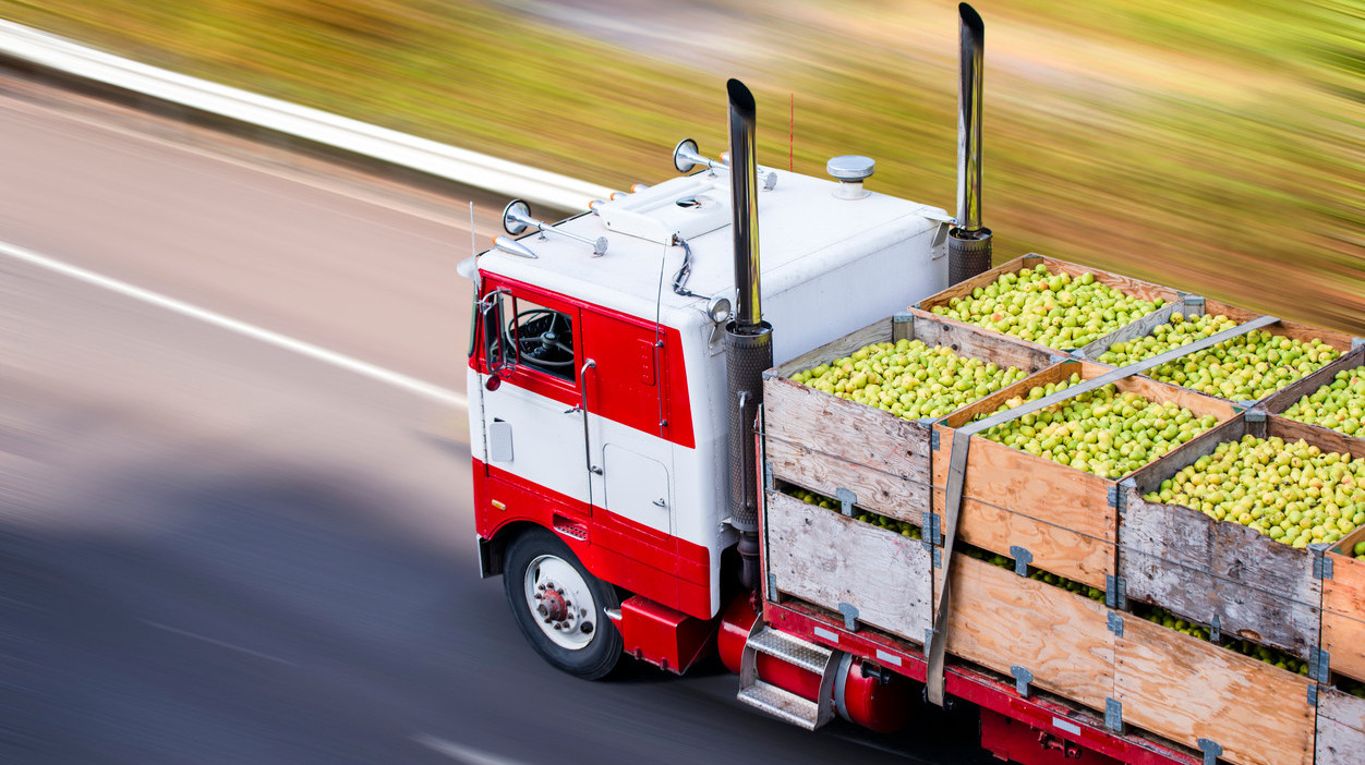
Most of us have a vague idea where our food comes from thanks to labels or signs in supermarkets: "Washington apples!" "New Zealand lamb!" We already know that the less food has to travel to get to us, the better, both environmentally and gastronomically. But now a team of researchers at the University of Illinois has developed a high-resolution map of the flow of food in and out of every county in the United States.
The map isn't interactive, so you can't find specific data about your own county, but there are 9.5 million links between counties, and you can see certain national patterns. The most well-worn paths are between California and Iowa, and Nebraska and the Gulf of Mexico. Los Angeles County tops the list in both imports and exports.
In a piece about the project in Fast Company, researcher Megan Konar writes, "The map shows how a shipment of corn starts at a farm in Illinois, travels to a grain elevator in Iowa before heading to a feedlot in Kansas, and then travels in animal products being sent to grocery stores in Chicago."
It's fascinating to think of your food's journey on its way to your plate. If you're into geeking out on spreadsheets, Konar and her team have also made one available for public consumption.