Dunkin's Holiday Cups Totally Sleigh
While Starbucks spent all its creative energy attempting to not offend anyone with its annual holiday cups, Dunkin' busted out the hot pink and had some fun with the assignment. Its 2019 holiday cup designs, which debut nationwide today, actually feel joyful compared to Starbucks' equal parts frenetic and dull offerings, and they're in line with Dunkin's overall brand. Here's how Dunkin' got it right.
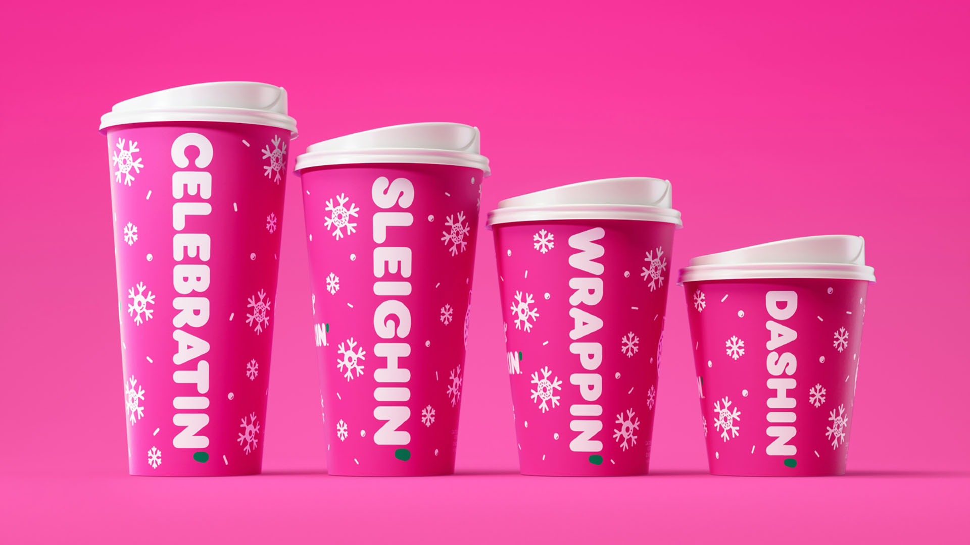
First, bright pink! It's a nice change of pace from all the green, red, silver, and gold you'll see everywhere else, but the white snowflakes and lids make clear the design is still wintery. I feel like Jonathan Van Ness approves. ("Serving me merry and bright and twinkling nondenominational holiday realness!")
Second, the cups' messages—Celebratin', Sleighin', Wrappin', Dashin'—echo Dunkin's apostrophe'd brand nicely. The messages are playful and youthful and succeed in conveying the sentiment Dunkin' says it was attempting to express: A sweet drink helps you indulge your inner child and take a much-needed break from adult holiday responsibilities. The cups, like the "take a moment for you" message, are cute but not juvenile.
The whole package—bright pink, fun messages—seems so much less stoic than Starbucks' offerings. The holidays, to say nothing of current events, can be difficult and stressful on their own. I like the idea that a peppermint mocha coffee cup isn't taking itself too seriously or trying to make a huge statement. The Dunkin' cups get that. They're the graphic equivalent of getting whipped cream and sprinkles on top of your latte, just because.